AccountView Components
An ever-growing library of 600+ components, powered by a semantic style framework, supporting multiple platforms.
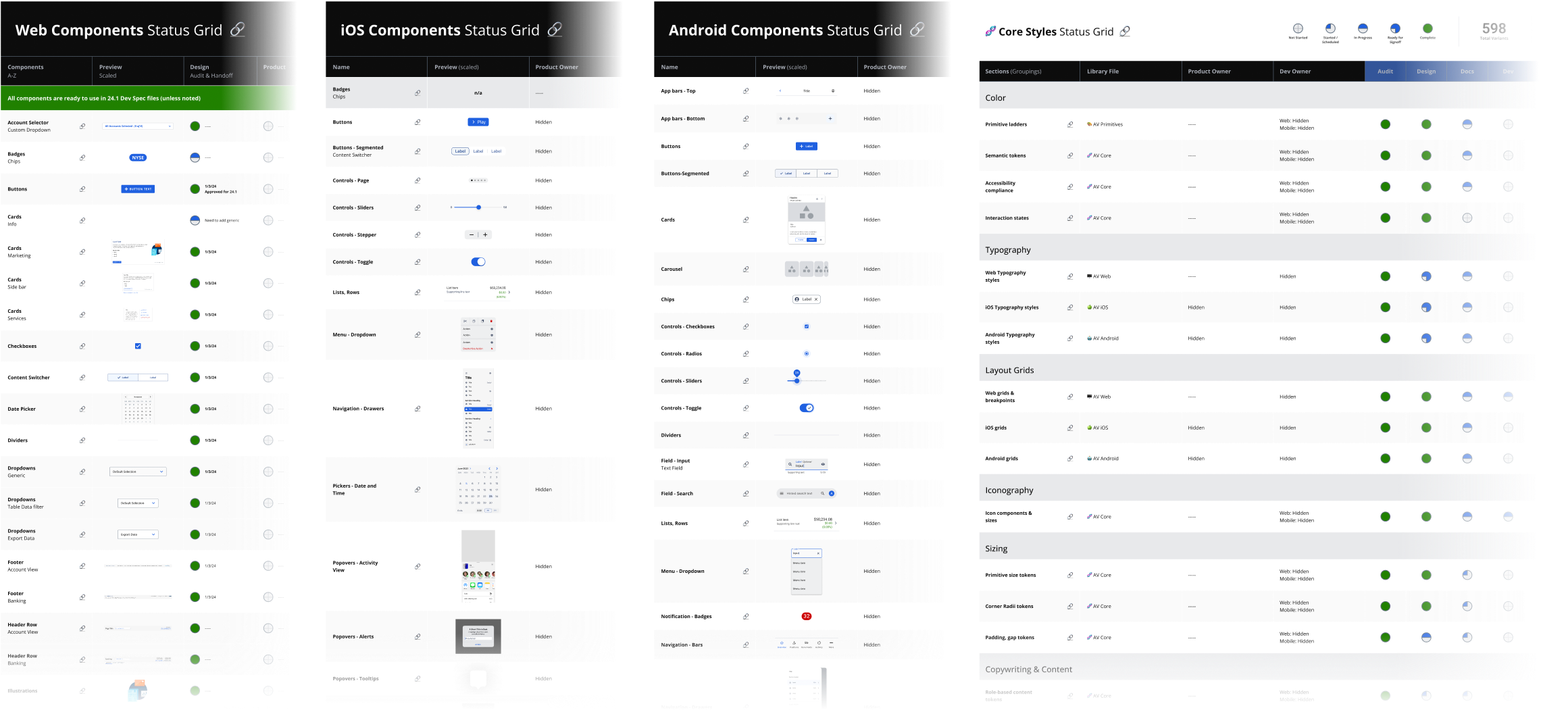
Once the style framework is solved, it unlocks complete componentization of the entire product. From individual, essential parts, to large combinations of pieces, components dramatically increase the ideation speed of design. All ideation and developer references are handed off with confidence, knowing its individual elements are accessible, vetted decisions. Decisions that no longer need to be constantly revisited.
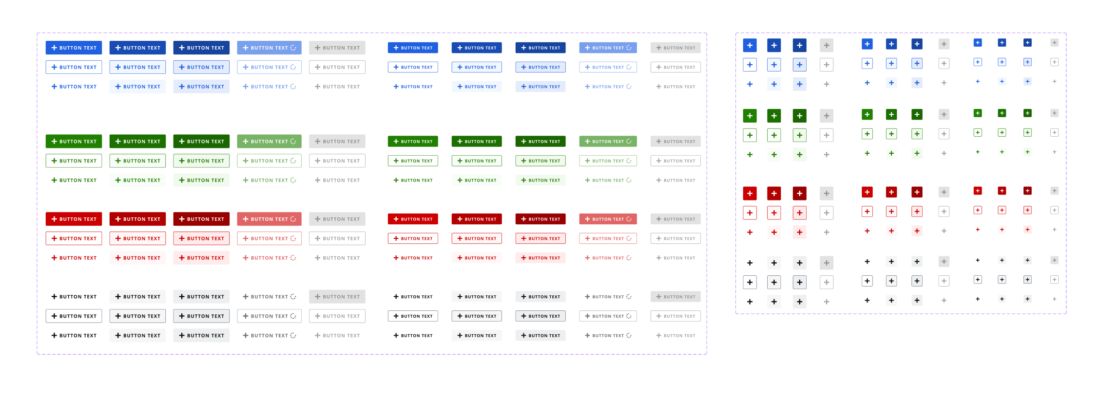

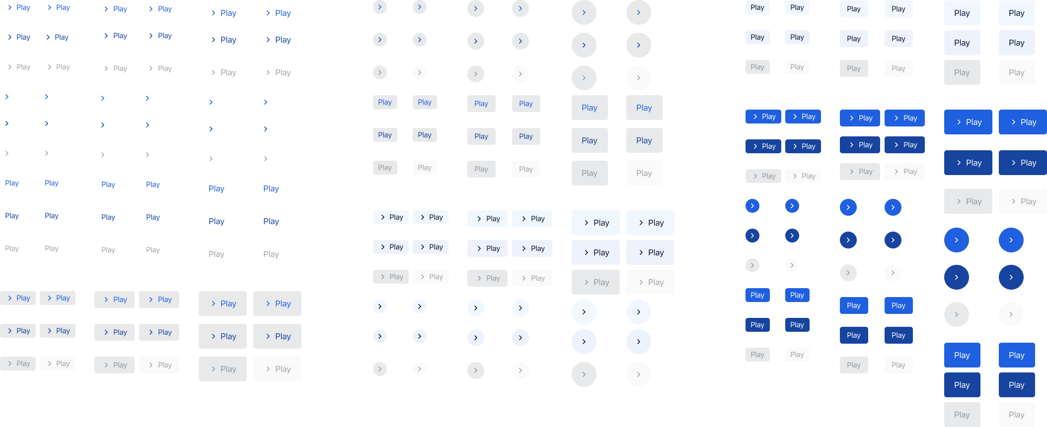
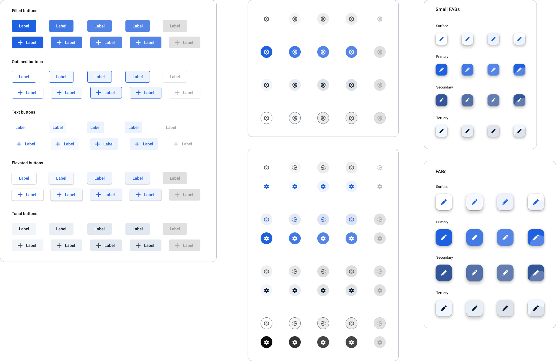
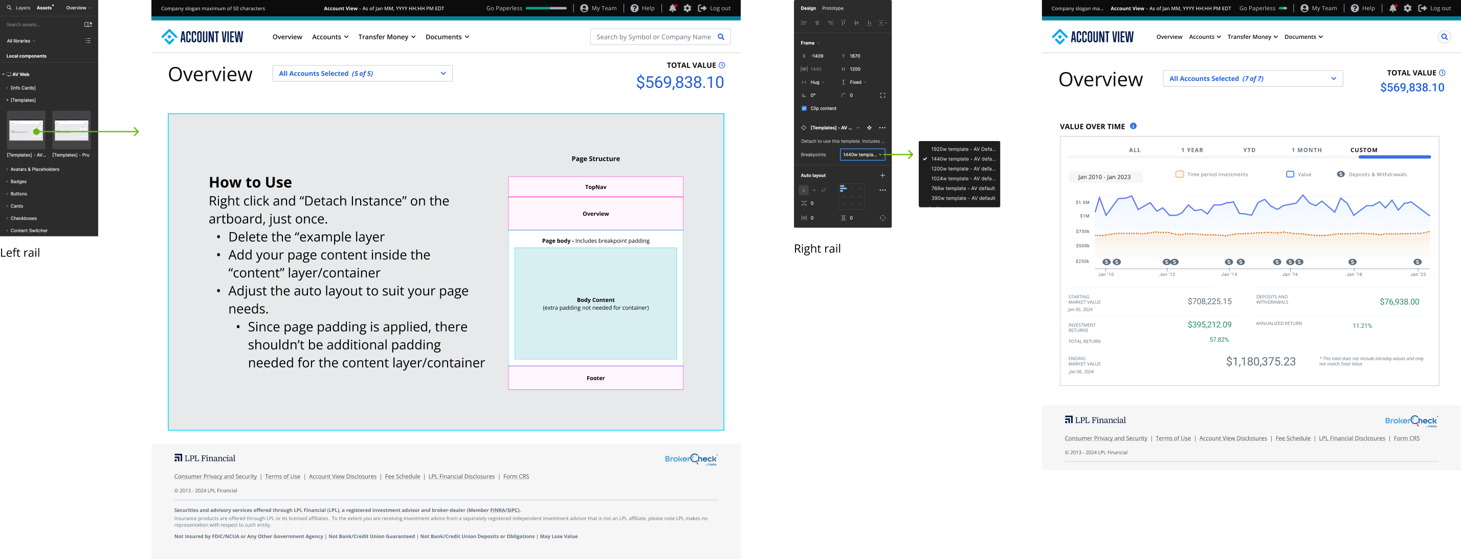


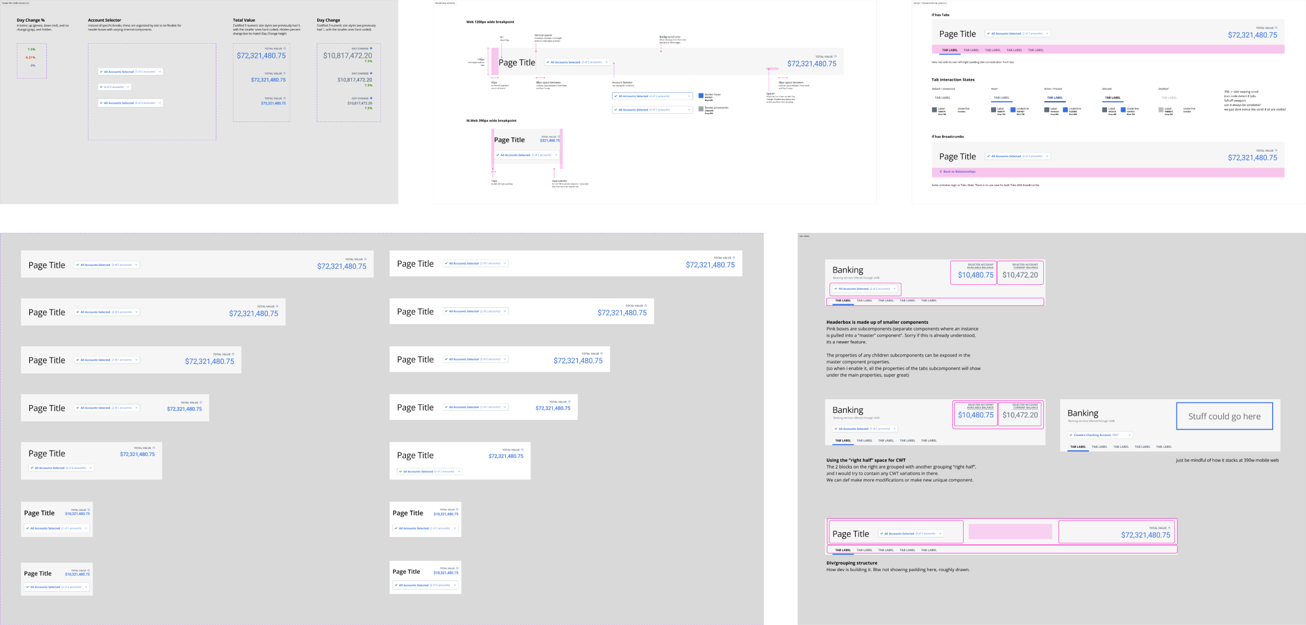
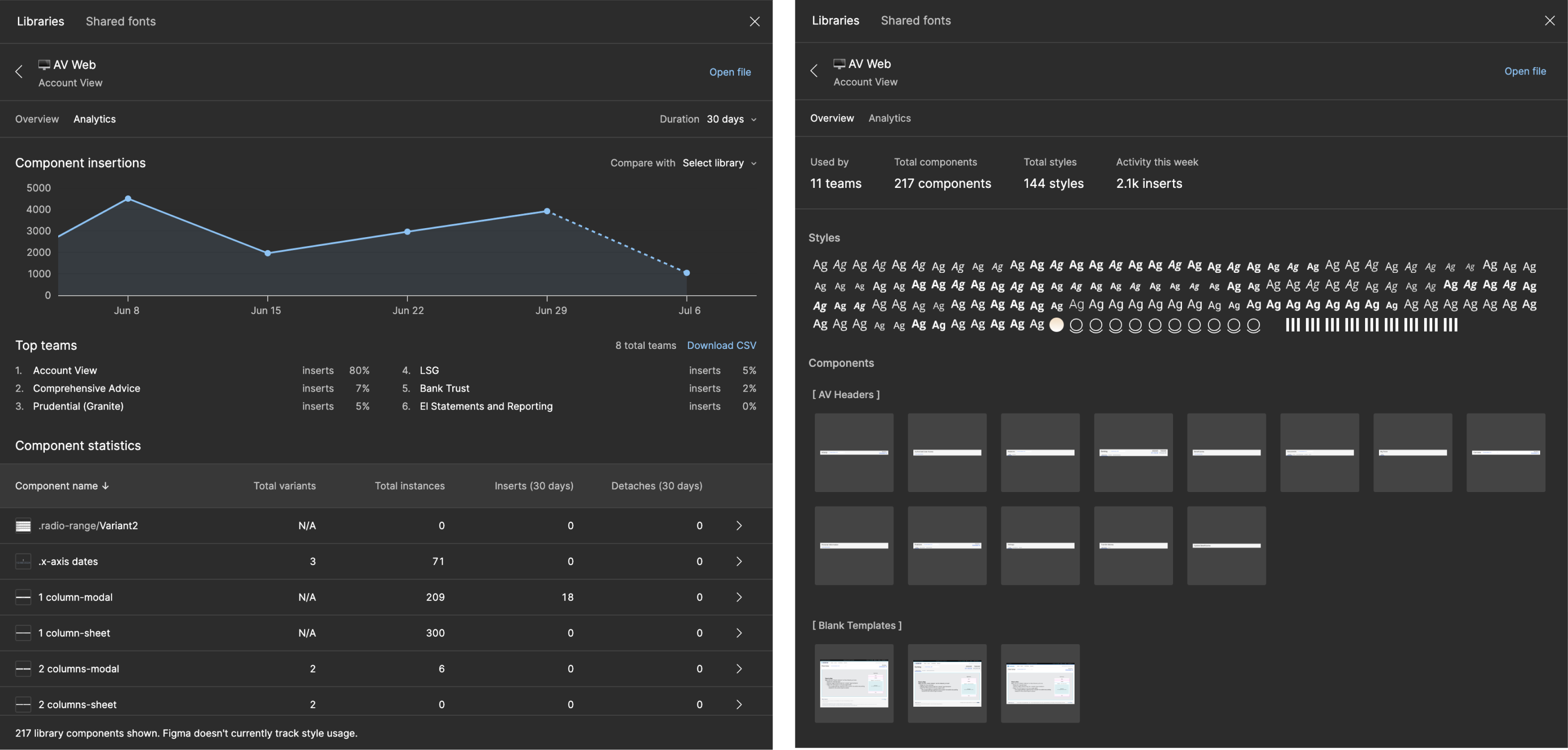
These component libraries are complemented by documentation and code guidance. While heavily inspired by best practices from leading design systems, it is ultimately bespoke to the unique nuances of this platform.