Solve Color First
Before typography or anything else.
By Andrew Yoon.

I thought type was most fundamental to design. That a website could be stripped of all color, visuals, and be prioritized with type alone.
Then one day, while keeping a tally in my notebook, I realized copywriting is a design abstraction. Simply putting a dot on paper says something, unique from a sequence of dots. A red dot vs a green dot. An unripe green apple vs a ripe red one.
The system of color priorities, what has the most visual priority (the most contrast), what is the next step down from that, normalized across the platform, and so on.
Color enables the expression of typography and UI. To not solve it first compounds every type and UI decision with the potential implications of different color strategies. There is an anxiety in allowing unexplored caves to linger, which the topic of color is rife with. A hidden gremlin may unexpectedly emerge, to ruin a new use case and your otherwise harmonious system.
It is the firmament that which first needs to be established. Almost like establishing the ground rules for this small world you’re creating. And while most designs will abide by nature in some way, our medium allows us to bend and break every rule.
I recommend that you first solve color.

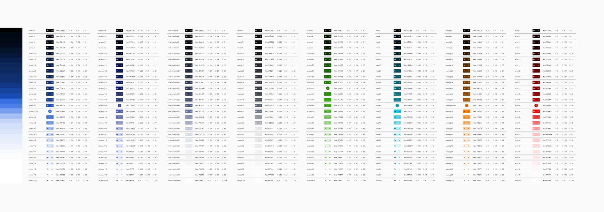
If it’s a new product, determine your primary brand color(s). Determine your neutral color (maybe it’s grayscale, maybe it has a tint, maybe it’s wild). Determine your universal accent colors (red, green, yellow). Maybe you want to be as normal as possible, maybe you want to give them a slight edge.
Then determine a ladder structure and apply your seed colors to them. I cannot explain why, but I notice these recurring geometric lines in design. Curves. I think the most effective ladders add extra granularity at the extremes. The most common colors are high contrast, because of that, it helps to have additional shades at the extremes or you’ll find yourself limiting your options, in practical terms. It’s fine to have many steps, but the whole point of steps are equal increments across all the different colors, so a 100 scale leaves too much choice, and as time goes on, there would be a lot of deviation and inconsistency.
Too few ladders, and there’s no ability for minor adjustments without updating all the color ladders, or leaving it as debt.
You want just enough to serve your current and future UI needs.