Paint with Priority
Creating designs agnostic of color and style.
By Andrew Yoon.

When we think of a design, we often visualize some form of a finished design, maybe black text on a white background. We subconsciously process all the nuances that visually rank orders everything, and just sort of see it as a finished design that "feels right".
Design Systems aim to codify this prioritization across all styles, affecting all components, expressed across the app and its platforms.

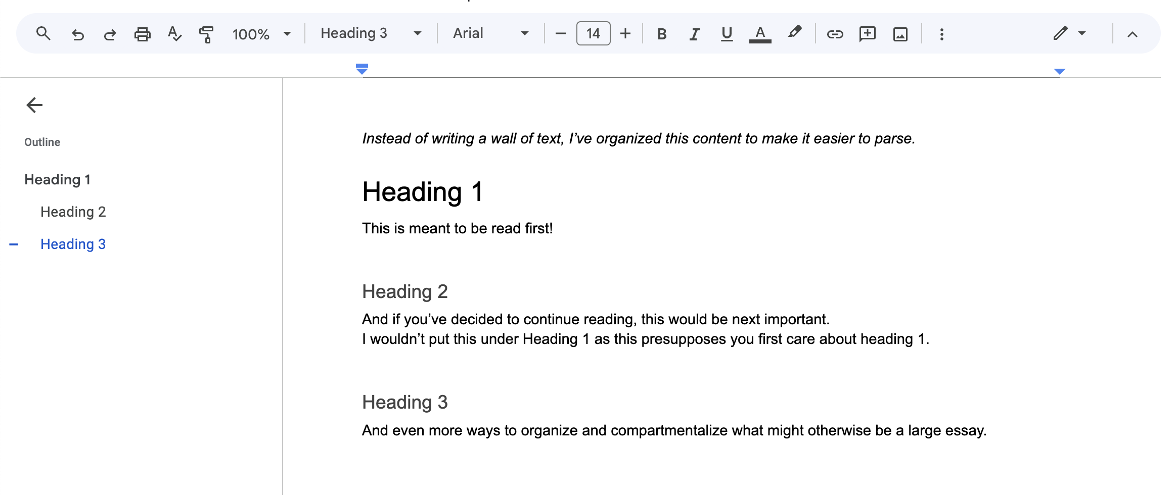
A simple example can be found in word processors like Google Docs. There is a system of headings, maybe 1-6. 1 being the most important, 6 being the least. Heading 1 is the largest and will likely be black. Heading 6 would be the smallest, and even using a shade of gray. Heading 1 has the higest visual priority on the page, it is whatever the designer wants to be noticed first. And heading 6 the opposite... you get it.
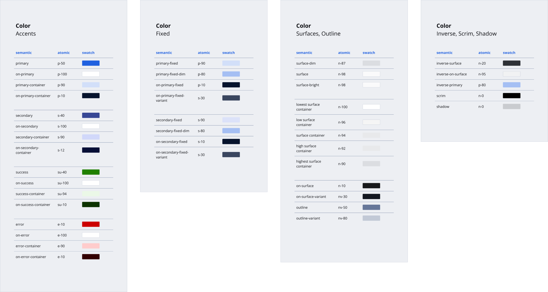
Now consider that ranked set of styles, but applied to different UI elements. The highest priority (aka contrast) background color. The lowest priority border stroke.

We sort out and do this naturally. With design systems, we codify these styles using a consistent naming schema, and this process separates the look and feel of the UI from its functional roles. What it does, its relationship to other things, and its visual priority.

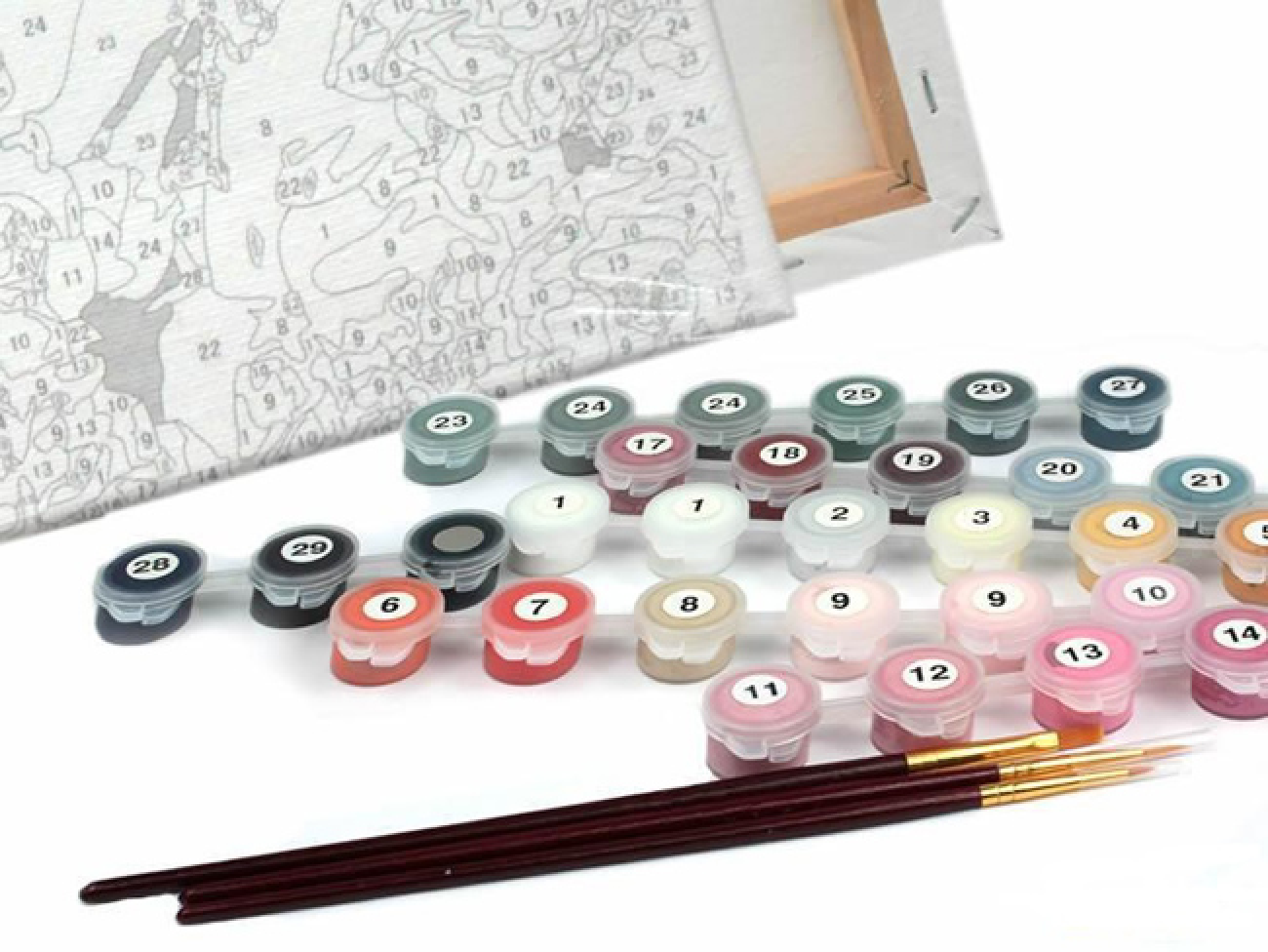
It's like painting by numbers from childhood, but instead they are H1's, H3's, border-strong, border-light, surface-main, surface-lowest.
Then depending on however you want your brand to look, you can flip a switch and switch between themes.
All of this is great for development, QA, and the craftsmanship of the app, but it's really a joy when it comes to design ideation. It provides high conviction when choosing styles, as you're picking from a curated set, whose labels have built-in context. It removes the extra mental task of thinking like a painter then having to translate that into a the UI framework. There is a significant increase in speed and really the freedom to think about other things.
Either through how its managed, or the naming schema itself, a style framework can both be flexible to evolve with changing needs and constantly trying to organize and simplify itself. Without this organization, style libraries often turn into junk drawers, that new designers make no sense of and will often inadvertantly misuse. Developers will come up with their own ways of organzing and labeling the system, and will often deviate over time, making things increasingly more difficult for QA to validate.
Design systems scale debt... the reduction or increase of it, and sometimes only helping or burdening a certain group. The more unified it's language and how it's organized, specifically with frontend development, the more everything skews towards less debt, a high bar of craftsmanship, and a much more satisfying process.